This guide presents a procedure for making seismic velocity maps at different depths using seismic tomography data produced by SmartTomo exploiting free and open source tools external to smartTomo.

Three georeferenced seismic profiles exported as a text grid were used for this tutorial. The processing involved the use of Python with the Pandas, Numpy, Scipy and Matplotlib modules.
Download the full code of this tutorial with dataset from here.
After installing Python, the modules can be installed with the pip command run from the command line (PowerShell on Windows):
python -m pip install numpy pandas scipy matplotlibSeismic tomography data exported from SmartTomo are formatted in a space-separated table saved in a text file:
186.593449 745.829673 -0.250000 589.178237
186.461571 746.311968 -0.250000 596.123248
186.329694 746.794263 -0.250000 602.781370
186.197816 747.276558 -0.250000 608.095063
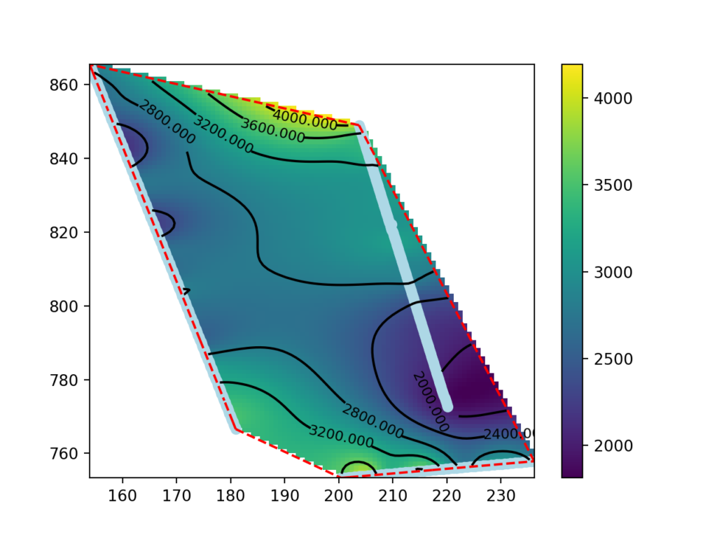
186.065939 747.758853 -0.250000 606.724411The coordinates (first and second columns) and depth (third column) correspond to the location and elevation of the center of the cell. The fourth column corresponds to the seismic wave velocity in m/s.
The three seismic profiles are saved in files L1.txt, L2.txt, L5.txt.
The following code imports the forms used for this example:
import pandas as pd          #import of modules
import numpy as np
from scipy.interpolate import RBFInterpolator # radial basis functions
from scipy.spatial import ConvexHull
import matplotlib.pyplot as plt
The data from the three profiles inside a Pandas DataFrame are read (read_csv) and the columns are named:
#loading of seismic profile exported as grid in to Pandas dataframe
l1 = pd.read_csv("L1.txt", sep=' ')
l1.columns = ["X", "Y","Z","Speed"]

l2 = pd.read_csv("L2.txt", sep=' ')
l2.columns = ["X", "Y","Z","Speed"]

l5 = pd.read_csv("L5.txt", sep=' ')
l5.columns = ["X", "Y","Z","Speed"]
The data from the three lines are concatenated, and data at the depth, for example, -5.25 meters are selected. Then the selected data are split into vectors containing only one variable.
# Concatenate together all the seismic data
all_lines = pd.concat([l1,l2,l5])

# and select data at -5.25m depth
df = all_lines.loc[result["Z"] == -5.25]

# Extract and convert each column to Numpy arrays
X = df["X"].to_numpy()
Y = df["Y"].to_numpy()
Z = df["Z"].to_numpy()
V = df["Speed"].to_numpy()
The x and y coordinate columns are merged together and the interpolator (RBFInterpolator) that will be used to construct the velocity map is initialized:
#paste together coordinates columns
coords = np.stack([X.ravel(),Y.ravel()],-1)

#inizialize interpolator based on RBF
rbf_int = RBFInterpolator(coords,V.ravel())
The following code constructs the rectangular grid inscribing the seismic tomography data with 100 cells per side.
x_fine = np.linspace(X.min(), X.max(), 100)
y_fine = np.linspace(Y.min(), Y.max(), 100)
x_grid, y_grid = np.meshgrid(x_fine, y_fine)

grid = np.stack([x_grid.ravel(),y_grid.ravel()],-1)
The following call to the function rbf_int the velocity is interpolated on the grid defined in the previous step:
z_grid = rbf_int(grid).reshape(x_grid.shape)The following code block is for map visualization. First, the graphical object is created on which the velocity map (pcolormesh), the seismic tomography points (scatter), the perimeter of the area of interest (plot), the isolinea (contour, clabel) and the color scale (colorbar) are drawn:
fig, ax = plt.subplots()    #init enviroments
cm = ax.pcolormesh(x_fine, y_fine, z_grid) #draw the map and save the colormodel cm
p = ax.scatter(X,Y,color = "lightblue") #add the points corrisponding to  input data

# compute and draw the smallest convex set that contains input data
hull = ConvexHull(coords)
for simplex in hull.simplices:
    plt.plot(coords[simplex, 0], coords[simplex, 1], 'k--',color = "red")

# draw contour lines
CS = ax.contour(x_fine, y_fine, z_grid, 10, colors='k')
ax.clabel(CS, fontsize=9, inline=True)

#add the color bar to the plot
fig.colorbar(cm)
#show the plot window
plt.show()
Download the full code of this tutorial with dataset from here.
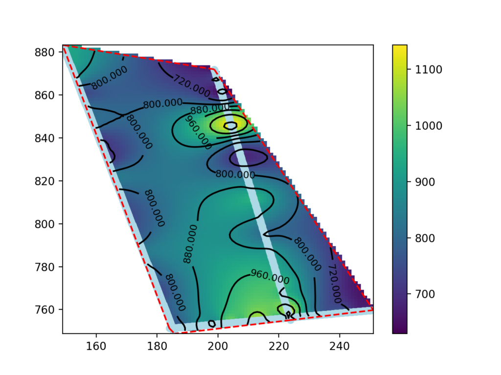
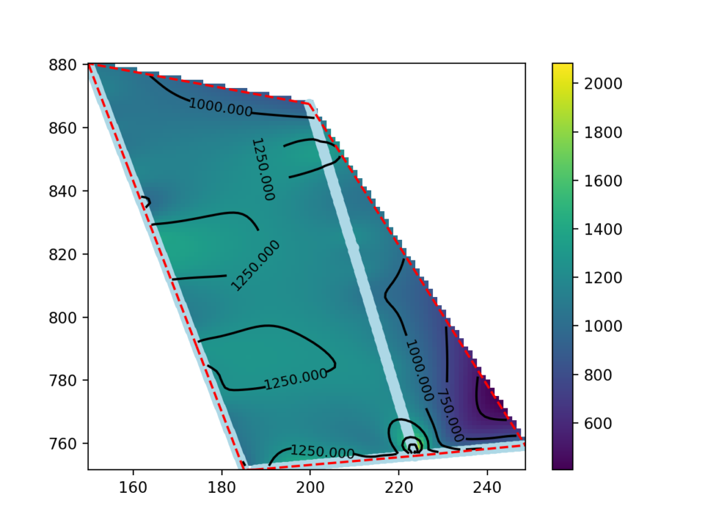
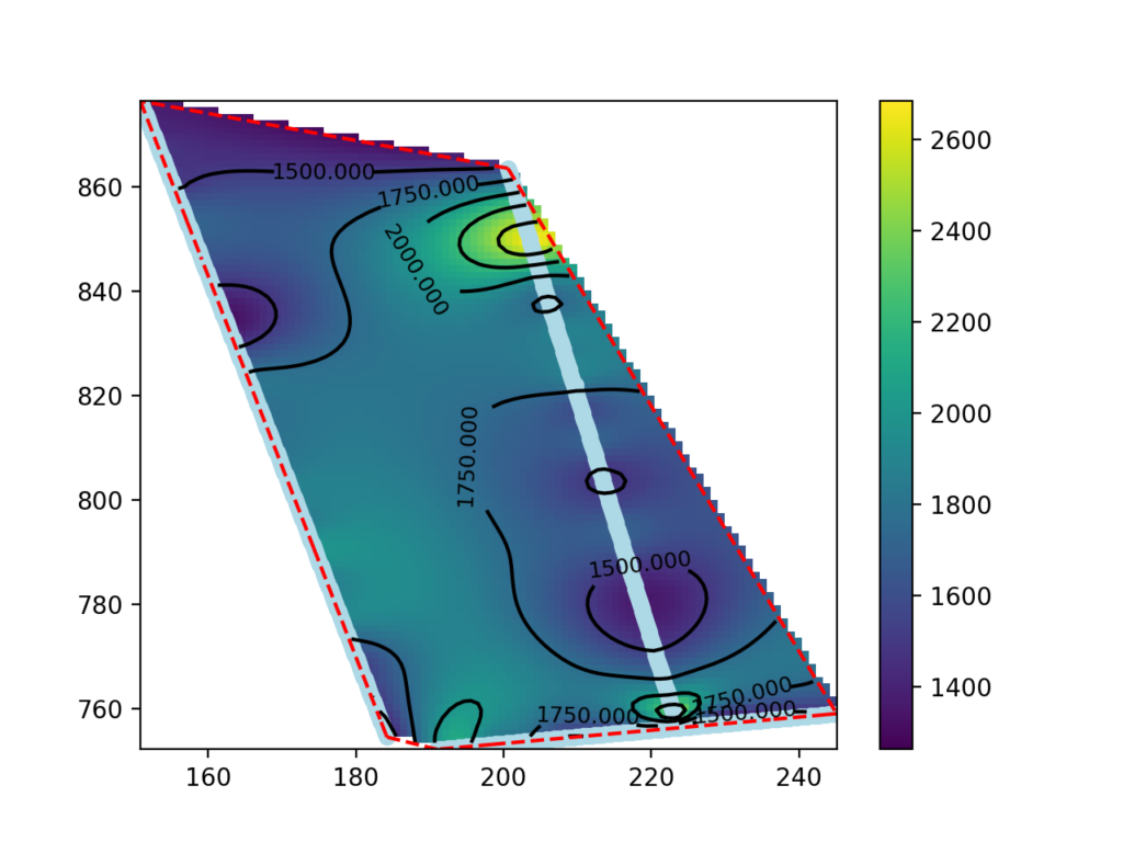
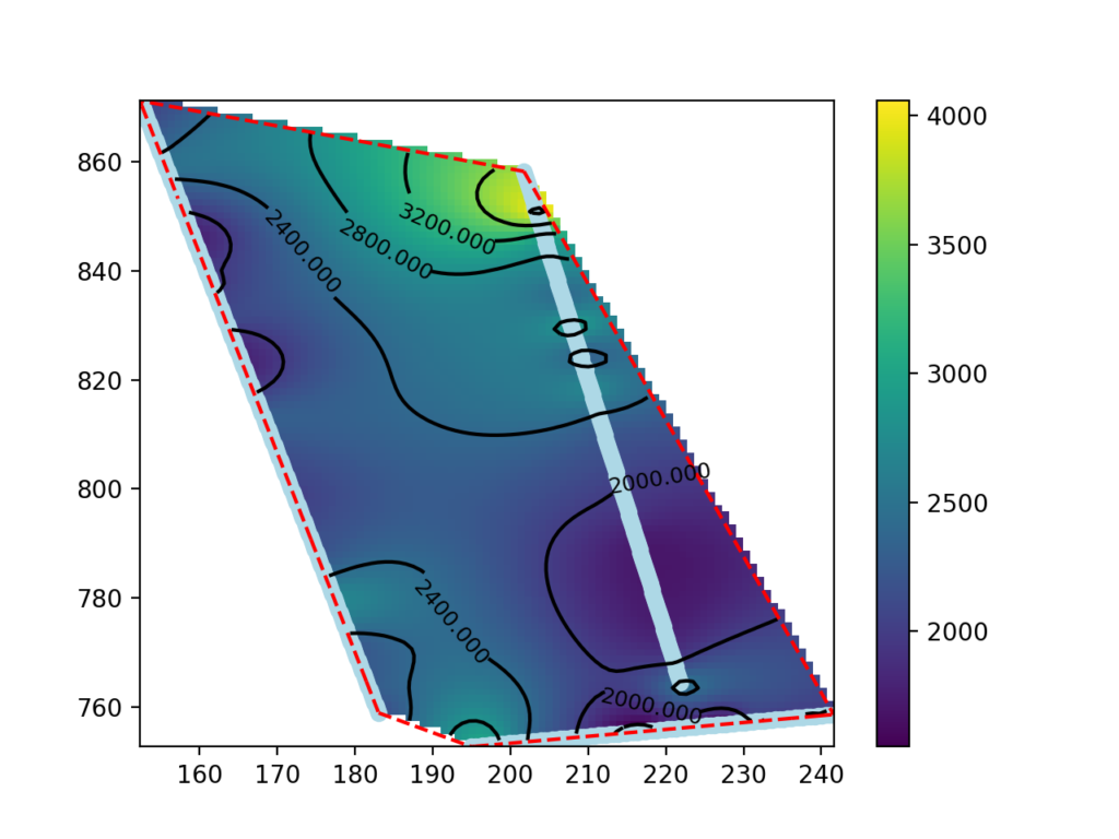
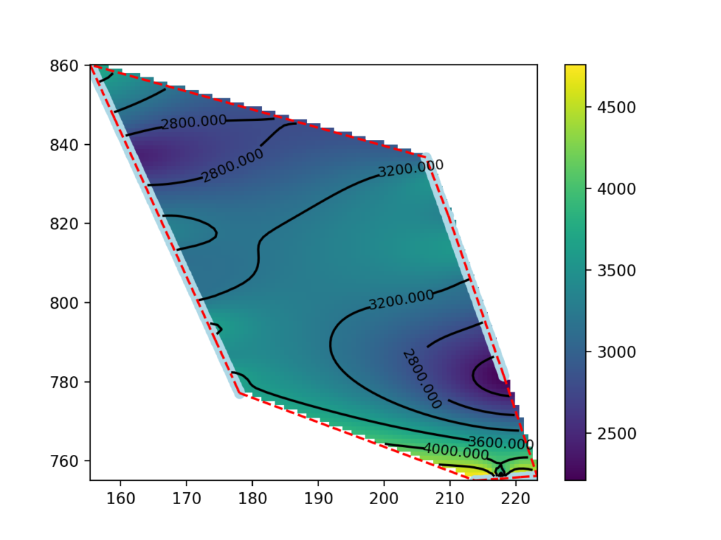
Display the significant part of the map.
The map made in the previous paragraph shows data outside the areas between the seismic lines as well. The data in these areas are extrapolated and may not be significant.
Below we will see how to eliminate the outer points and thus display only the values within the perimeter. At the beginning of the code in the previous paragraph you define the following function to calculate which points fall inside the convex hull:
# code from https://stackoverflow.com/a/16898636
def in_hull(p, hull):
    """
    Test if points in `p` are in `hull`

    `p` should be a `NxK` coordinates of `N` points in `K` dimensions
    `hull` is either a scipy.spatial.Delaunay object or the `MxK` array of the
    coordinates of `M` points in `K`dimensions for which Delaunay triangulation
    will be computed
    """
    from scipy.spatial import Delaunay
    if not isinstance(hull,Delaunay):
        hull = Delaunay(hull)

    return hull.find_simplex(p)>=0
Data are filtered to remove those outside the perimeter inscribing seismic tomography data:
inhull = in_hull(grid,coords)
i=0
j=0
k=0
for z in z_grid:
    j = 0
    for zz in z:
        if inhull[i] == False:
            z_grid[k][j] = np.nan
        i= i + 1
        j= j + 1
    k = k + 1
In this way, the outer points are set to a value corresponding to np.nan (not a number), which is ignored in the graph drawing phase.